The following are my notes from a talk I gave at OSCON 2013. Here is the Github source of these Jupyter/IPython notebooks: https://github.com/calebmadrigal/FourierTalkOSCON
Sound Analysis with the Fourier Transform and Python
Link to repo: http://tinyurl.com/fourierpython
Intro
- Welcome
- Format of talk
- Everything is in iPython Notebook (on Github)
- You don't need to take notes
- Please save questions for the end
- Why this is interesting
- Sound processing is big - natural human-machine interfaces (e.g. Siri)
- Noise reduction, Compression, feature extraction (e.g. speech)
- Understanding our universe better (Superposition, Harmonics, Sound timbre)
Overview
- The Nature of Waves
- The Fourier Transform
- Fast Fourier Transform (FFT) in Python
- Audio analysis
%matplotlib inline
import matplotlib.pyplot as plt
import numpy as np
import scipy
# Graphing helper function
def setup_graph(title='', x_label='', y_label='', fig_size=None):
fig = plt.figure()
if fig_size != None:
fig.set_size_inches(fig_size[0], fig_size[1])
ax = fig.add_subplot(111)
ax.set_title(title)
ax.set_xlabel(x_label)
ax.set_ylabel(y_label)
The Nature of Waves
We're mainly going to talk about sound waves, but many of these things will apply to other types of waves.
How do we represent waves?
freq = 1 #hz - cycles per second
amplitude = 3
time_to_plot = 2 # second
sample_rate = 100 # samples per second
num_samples = sample_rate * time_to_plot
t = np.linspace(0, time_to_plot, num_samples)
signal = [amplitude * np.sin(freq * i * 2*np.pi) for i in t] # Explain the 2*pi
setup_graph(x_label='time (in seconds)', y_label='amplitude', title='time domain')
plt.plot(t, signal)

In the context of sound, what would a wave like this represent?
- Answer: Changes in air pressure
- When the graph is above x=0, the pressure of the air is more than "normal" (air is moving toward you)
- When the graph is below x=0, the pressure of the air is less than "normal" (air is moving away from you)
Example of a real sound wave
import scipy.io.wavfile
(sample_rate, input_signal) = scipy.io.wavfile.read("audio_files/vowel_ah.wav")
time_array = np.arange(0, len(input_signal)/sample_rate, 1/sample_rate)
setup_graph(title='Ah vowel sound', x_label='time (in seconds)', y_label='amplitude', fig_size=(14,7))
_ = plt.plot(time_array[0:4000], input_signal[0:4000])

The Superposition Principle
- If you add a bunch of waves together, it forms one wave.
- Hearing me talk while knocking on the desk
Example
# Two subplots, the axes array is 1-d
x = np.linspace(0, 2 * np.pi, 100)
y1 = 5 * np.sin(x)
y2 = 0 * np.sin(2*x)
y3 = 3 * np.sin(3*x)
y4 = 2 * np.sin(4*x)
f, axarr = plt.subplots(4, sharex=True, sharey=True)
f.set_size_inches(12,6)
axarr[0].plot(x, y1)
axarr[1].plot(x, y2)
axarr[2].plot(x, y3)
axarr[3].plot(x, y4)
_ = plt.show()

setup_graph(x_label='time', y_label='amplitude', title='y1+y2+y3+y4', fig_size=(12,6))
convoluted_wave = y1 + y2 + y3 + y4
_ = plt.plot(x, convoluted_wave)

Wave Interference Example
This is how noise-canceling headphones work
y5 = np.sin(3 * x)
y6 = -1 * np.sin(3 * x)
f, axarr = plt.subplots(3, sharex=True, sharey=True)
f.set_size_inches(12,6)
axarr[0].plot(x, y5, 'b')
axarr[1].plot(x, y6, 'g')
axarr[2].plot(x, y5 + y6, 'r')
_ = plt.show()

# Graphing helper function
def setup_graph(title='', x_label='', y_label='', fig_size=None):
fig = plt.figure()
if fig_size != None:
fig.set_size_inches(fig_size[0], fig_size[1])
ax = fig.add_subplot(111)
ax.set_title(title)
ax.set_xlabel(x_label)
ax.set_ylabel(y_label)
Fourier Transform
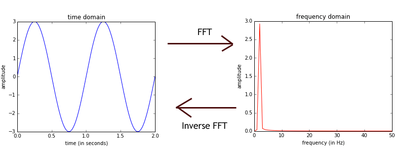
Time to Frequency Domain
The Fourier Transform is like a prism (not the NSA one)
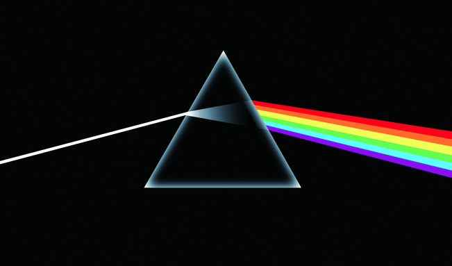
Prism
Fourier Transform Definition
\[G(f) = \int_{-\infty}^\infty g(t) e^{-i 2 \pi f t} dt\]
For our purposes, we will just be using the discrete version...
Discrete Fourier Transform (DFT) Definition
\[G(\frac{n}{N}) = \sum_{k=0}^{N-1} g(k) e^{-i 2 \pi k \frac{n}{N} }\]
Meaning:
- \(N\) is the total number of samples
- \(g(k)\) is the kth sample for the time-domain function (i.e. the DFT input)
- \(G(\frac{n}{N})\) is the output of the DFT for the frequency that is \(\frac{n}{N}\) cycles per sample; so to get the frequency, you have to multiply \(n/N\) by the sample rate.
How to represent waves
%matplotlib inline
import matplotlib.pyplot as plt
import numpy as np
import scipy
freq = 1 #hz - cycles per second
amplitude = 3
time_to_plot = 2 # second
sample_rate = 100 # samples per second
num_samples = sample_rate * time_to_plot
t = np.linspace(0, time_to_plot, num_samples)
signal = [amplitude * np.sin(freq * i * 2*np.pi) for i in t] # Explain the 2*pi
Why the 2*pi?
- If we want a wave which completes 1 cycle per second, so sine must come back to the same position on a circle as the starting point
- So one full rotation about a circle - \(2 \pi\) (in radians)
sine_curve
Plot the wave
setup_graph(x_label='time (in seconds)', y_label='amplitude', title='time domain')
plt.plot(t, signal)
Convert to the Frequency Domain
fft_output = np.fft.rfft(signal)
magnitude_only = [np.sqrt(i.real**2 + i.imag**2)/len(fft_output) for i in fft_output]
frequencies = [(i*1.0/num_samples)*sample_rate for i in range(num_samples//2+1)]
setup_graph(x_label='frequency (in Hz)', y_label='amplitude', title='frequency domain')
plt.plot(frequencies, magnitude_only, 'r')

Question: So what does the Fourier Transform give us?
- The amplitudes of simple sine waves
- Their starting position - phase (we won't get into this part much)
Question: what sine wave frequencies are used?
- Answer: This is determined by how many samples are provided to the Fourier Transform
- Frequencies range from 0 to (number of samples) / 2
- Example: If your sample rate is 100Hz, and you give the FFT 100 samples, the FFT will return the amplitude of the components with frequencies 0 to 50Hz.
%matplotlib inline
import matplotlib.pyplot as plt
import numpy as np
import scipy
# Graphing helper function
def setup_graph(title='', x_label='', y_label='', fig_size=None):
fig = plt.figure()
if fig_size != None:
fig.set_size_inches(fig_size[0], fig_size[1])
ax = fig.add_subplot(111)
ax.set_title(title)
ax.set_xlabel(x_label)
ax.set_ylabel(y_label)
Wave Deconvolution - Multiplication and Addition
- So a complex wave is made of simple waves.
- How can you break a complex wave into it's simple component waves?
Answer: Multiplying a wave by another wave of frequency 100Hz cancels out all of the other component waves and leaves only the 100Hz component (kind of).
t = np.linspace(0, 3, 200)
freq_1hz_amp_10 = 10 * np.sin(1 * 2*np.pi*t)
freq_3hz_amp_5 = 5 * np.sin(3 * 2*np.pi*t)
complex_wave = freq_1hz_amp_10 + freq_3hz_amp_5
setup_graph(x_label='time (in seconds)', y_label='amplitude', title='original wave', fig_size=(12,6))
_ = plt.plot(t, complex_wave)

Multiply complex wave by 1Hz wave
freq_1hz = np.sin(1 * 2*np.pi*t)
setup_graph(x_label='time (in seconds)', y_label='amplitude', title='original wave * 1Hz wave', fig_size=(12,6))
_ = plt.plot(t, complex_wave * freq_1hz)

sum(complex_wave*freq_1hz)
print("Amplitude of 1hz component: ", sum(complex_wave*freq_1hz) * 2.0 * 1.0/len(complex_wave))
Multiply complex wave by 3Hz wave
Notice that more of the graph is above the x-axis then below it.
freq_3hz = np.sin(3 * 2*np.pi*t)
setup_graph(x_label='time (in seconds)', y_label='amplitude', title='complex wave * 3Hz wave', fig_size=(12,6))
_ = plt.plot(t, complex_wave * freq_3hz)

sum(complex_wave*freq_3hz)
print("Amplitude of 3hz component: ", sum(complex_wave*freq_3hz) * 2.0/len(complex_wave))
Multiply complex wave by 2Hz wave
Notice that an equal amount of the graph is above the x-axis as below it.
freq_2hz = np.sin(2 * 2*np.pi*t)
setup_graph(x_label='time (in seconds)', y_label='amplitude', title='complex wave * 2Hz wave', fig_size=(12,6))
_ = plt.plot(t, complex_wave * freq_2hz)

sum(complex_wave*freq_2hz)
# Very close to 0
print("Amplitude of 3hz component: ", sum(complex_wave*freq_2hz) * 2.0/len(complex_wave))
# Same with 4Hz - close to 0
freq_4hz = np.sin(4 * 2*np.pi*t)
sum(complex_wave*freq_4hz)
So how does this work?
The summation of complex wave multiplied by simple wave of a given frequency leaves us with the "power" of that simple wave.
%matplotlib inline
import matplotlib.pyplot as plt
import numpy as np
import scipy
# Graphing helper function
def setup_graph(title='', x_label='', y_label='', fig_size=None):
fig = plt.figure()
if fig_size != None:
fig.set_size_inches(fig_size[0], fig_size[1])
ax = fig.add_subplot(111)
ax.set_title(title)
ax.set_xlabel(x_label)
ax.set_ylabel(y_label)
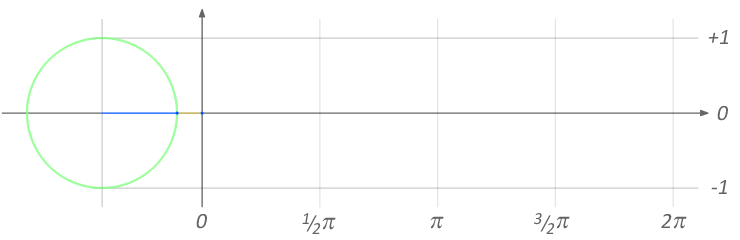
Euler's Formula
\[e^{ix} = \cos(x) + i \sin(x)\]
So raising \(e^{ix}\) produces rotation (in the Complex plane)
Related to Euler's Identity
\[e^{i \pi} + 1 = 0\]
- At \(x = \pi\), \(\sin(\pi) = 0\), and \(\cos(\pi) = -1\)
- So \(e^{i \pi} = -1 + 0\)
- Move the 1 over: \(e^{i \pi} + 1 = 0\)
Complex Plane
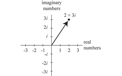
Complex Plane
# Generate some complex numbers, and convert them to (x,y) coordinates
complex_points = [np.e**(1j * i) for i in np.linspace(0, 2*np.pi, 16)]
real_parts = [z.real for z in complex_points]
imag_parts = [z.imag for z in complex_points]
# Matplotlib code to draw graph
fig = plt.figure()
fig.set_size_inches(6, 6)
ax = fig.add_subplot(111)
ax.spines['left'].set_position('center')
ax.spines['bottom'].set_position('center')
ax.spines['top'].set_color('none')
ax.spines['right'].set_color('none')
ax.set_xlim((-1.5,1.5))
ax.set_xticks(np.linspace(-1.5,1.5,4))
ax.set_ylim((-1.5,1.5))
ax.set_yticks(np.linspace(-1.5,1.5,4))
ax.annotate("{0} + {1}i".format(real_parts[1], imag_parts[1]), xy=(real_parts[1], \
imag_parts[1]), xytext=(1,1), arrowprops=dict(facecolor='black', shrink=0.08))
_ = plt.plot(real_parts, imag_parts, 'go')

Going around a circle produces sine and cosine waves

sine_curve
Circles produce sin (and cos) waves
t = np.linspace(0, 3 * 2*np.pi, 100)
e_func = [np.e**(1j * i) for i in t]
setup_graph(title='real part (cosine) of e^ix', x_label='time', y_label='amplitude of real part', fig_size=(12,6))
_ = plt.plot(t, [i.real for i in e_func])

setup_graph(title='imaginary part (sin) of e^ix', x_label='time', y_label='amplitude of imaginary part', fig_size=(12,6))
_ = plt.plot(t, [i.imag for i in e_func])

%matplotlib inline
import matplotlib.pyplot as plt
import numpy as np
import scipy
# Graphing helper function
def setup_graph(title='', x_label='', y_label='', fig_size=None):
fig = plt.figure()
if fig_size != None:
fig.set_size_inches(fig_size[0], fig_size[1])
ax = fig.add_subplot(111)
ax.set_title(title)
ax.set_xlabel(x_label)
ax.set_ylabel(y_label)
Sampling a test function
Wave with:
- Frequency of 1 Hz
- Amplitude of 5
We will sample:
- At 10 samples per second
- For 3 seconds
- So a total of 30 samples
sample_rate = 10 # samples per sec
total_sampling_time = 3
num_samples = sample_rate * total_sampling_time
t = np.linspace(0, total_sampling_time, num_samples)
# between x = 0 and x = 1, a complete revolution (2 pi) has been made, so this is
# a 1 Hz signal with an amplitude of 5
frequency_in_hz = 1
wave_amplitude = 5
f = lambda x: wave_amplitude * np.sin(frequency_in_hz * 2*np.pi*x)
sampled_f = [f(i) for i in t]
setup_graph(title='time domain', x_label='time (in seconds)', y_label='amplitude', fig_size=(12,6))
_ = plt.plot(t, sampled_f)

Take the fft
fft_output = np.fft.fft(sampled_f)
setup_graph(title='FFT output', x_label='FFT bins', y_label='amplitude', fig_size=(12,6))
_ = plt.plot(fft_output)

Why is it symmetric?
- Because it is a complex-input fourier transform, and for real input, the 2nd half will always be a mirror image.
- For real-valued input, the fft output is always symmetric.
- Since we are only dealing with real input, let's just use a real-input version of the fft.
rfft_output = np.fft.rfft(sampled_f)
setup_graph(title='rFFT output', x_label='frequency (in Hz)', y_label='amplitude', fig_size=(12,6))
_ = plt.plot(rfft_output)

Get the x-axis labels correct
We want the x-axis to represent frequency
In our DFT equation \[G(\frac{n}{N}) = \sum_{k=0}^{N-1} g(k) e^{-i 2 \pi k \frac{n}{N} }\]
- \(G(\frac{n}{N})\) means the DFT output for the frequency which goes through \(\frac{n}{N}\) cycles per sample.
- And we take frequencies from 0 to (the total number of samples divided by 2)
# Getting frequencies on x-axis right
rfreqs = [(i*1.0/num_samples)*sample_rate for i in range(num_samples//2+1)]
Frequencies range from 0 to the Nyquist Frequency (sample rate / 2)
# So you can see, our frequencies go from 0 to 5Hz. 5 is half of the sample rate,
# which is what it should be (Nyquist Frequency).
rfreqs
setup_graph(title='Corrected rFFT Output', x_label='frequency (in Hz)', y_label='amplitude', fig_size=(12,6))
_ = plt.plot(rfreqs, rfft_output)

Getting y-axis labels correct
We want the y-axis to represent magnitude
We are actually getting negative values, and it looks like our amplitude is way larger than what it should be (which is 5).
The magnitude of each component is:
\[magnitude(i) = \frac{\sqrt{i.real^2 + i.imag^2}}{N}\]
rfft_mag = [np.sqrt(i.real**2 + i.imag**2)/len(rfft_output) for i in rfft_output]
setup_graph(title='Corrected rFFT Output', x_label='frequency (in Hz)', y_label='magnitude', fig_size=(12,6))
_ = plt.plot(rfreqs, rfft_mag)

Inverse FFT
We can take the output of the FFT and perform an Inverse FFT to get back to our original wave (using the Inverse Real FFT - irfft).
irfft_output = np.fft.irfft(rfft_output)
setup_graph(title='Inverse rFFT Output', x_label='time (in seconds)', y_label='amplitude', fig_size=(12,6))
_ = plt.plot(t, irfft_output)

%matplotlib inline
import matplotlib.pyplot as plt
import numpy as np
import scipy
import scipy.io.wavfile
import IPython
def setup_graph(title='', x_label='', y_label='', fig_size=None):
fig = plt.figure()
if fig_size != None:
fig.set_size_inches(fig_size[0], fig_size[1])
ax = fig.add_subplot(111)
ax.set_title(title)
ax.set_xlabel(x_label)
ax.set_ylabel(y_label)
Seeing sound!
# NOTE: This is only works with 1 channel (mono). To record a mono audio sample,
# you can use this command: rec -r 44100 -c 1 -b 16 test.wav
(sample_rate, input_signal) = scipy.io.wavfile.read("audio_files/vowel_ah.wav")
time_array = np.arange(0, len(input_signal)/sample_rate, 1/sample_rate)
setup_graph(title='Ah vowel sound', x_label='time (in seconds)', y_label='amplitude', fig_size=(14,7))
_ = plt.plot(time_array[0:4000], input_signal[0:4000])
#IPython.display.Audio("audio_files/vowel_ah.wav")
fft_out = np.fft.rfft(input_signal)
fft_mag = [np.sqrt(i.real**2 + i.imag**2)/len(fft_out) for i in fft_out]
num_samples = len(input_signal)
rfreqs = [(i*1.0/num_samples)*sample_rate for i in range(num_samples//2+1)]
setup_graph(title='FFT of Ah Vowel (first 5000)', x_label='FFT Bins', y_label='magnitude', fig_size=(14,7))
_ = plt.plot(rfreqs[0:5000], fft_mag[0:5000])

Few notes about this
- Ratio of harmonics = timbre = This is what makes different people's voices sound different (and different from violins)
- Even if they are singing the same note, and the same volume
- Possible application: synthesizing new sounds (with different harmonic profiles)
- Example: If you changed the ratio of the harmonics, you could make your voice sound like something else (Darth Vader?)
Spectrogram (FFT over time)
Axes
- x-axis: time
- y-axis: frequency
- z-axis (color): strength of each frequency
See the Harmonics!
(doremi_sample_rate, doremi) = scipy.io.wavfile.read("audio_files/do-re-mi.wav")
setup_graph(title='Spectrogram of diatonic scale (44100Hz sample rate)', x_label='time (in seconds)', y_label='frequency', fig_size=(14,8))
_ = plt.specgram(doremi, Fs=doremi_sample_rate)

doremi_8000hz = [doremi[i] for i in range(0, len(doremi), 44100//8000)]
setup_graph(title='Spectrogram (8000Hz sample rate)', x_label='time (in seconds)', y_label='frequency', fig_size=(14,7))
_ = plt.specgram(doremi_8000hz, Fs=8000)

doremi_4000hz = [doremi[i] for i in range(0, len(doremi), 44100//4000)]
setup_graph(title='Spectrogram (4000Hz sample rate)', x_label='time (in seconds)', y_label='frequency', fig_size=(14,7))
_ = plt.specgram(doremi_4000hz, Fs=4000)

A few things to note
- Something that sounds like a single note actually is made up of a bunch of harmonics
- Harmonics are integer multiples of the fundamental frequency
- Notice that the spacing between the harmonics of the first note is about double of the spacing between the harmonics in the last note (1 octave difference)
# Cleanup to reduce notebook size
del input_signal, time_array, rfreqs, doremi, fft_out, fft_mag, doremi_4000hz, doremi_8000hz, _
%matplotlib inline
import matplotlib.pyplot as plt
import numpy as np
import scipy
import scipy.io.wavfile
def setup_graph(title='', x_label='', y_label='', fig_size=None):
fig = plt.figure()
if fig_size != None:
fig.set_size_inches(fig_size[0], fig_size[1])
ax = fig.add_subplot(111)
ax.set_title(title)
ax.set_xlabel(x_label)
ax.set_ylabel(y_label)
Short-time Fourier Transform (STFT)
Procedure:
- Break audio file into (overlapping) chunks
- Apply a window to each chunk
- Run windowed chunk through the FFT
Hamming Window
sample_rate = 100 # in samples per second
total_time = 10 # in seconds
t = np.linspace(0, total_time, total_time * sample_rate)
original = [5 for i in t]
setup_graph(title='f(x) = 5 function', x_label='time (in seconds)', y_label='amplitude')
_ = plt.plot(t, original)

window_size = 100 # 100 points (which is 1 second in this case)
hop_size = window_size // 2
window = scipy.hamming(window_size)
What the windows look like
def flatten(lst):
return [item for sublist in lst for item in sublist]
window_times = [t[i:i+window_size] for i in range(0, len(original)-window_size, hop_size)]
window_graphs = [[wtime, window] for wtime in window_times]
flattened_window_graphs = flatten(window_graphs)
setup_graph(title='Hamming windows', x_label='time (in seconds)', y_label='amplitude', fig_size=(14,5))
_ = plt.plot(*flattened_window_graphs)

Break up into chunks and apply window
windowed = [window * original[i:i+window_size] for i in range(0, len(original)-window_size, hop_size)]
Put windowed chunks back together (and compare to original)
(This is like what the inverse STFT does)
convoluted = scipy.zeros(total_time * sample_rate)
for n,i in enumerate(range(0, len(original)-window_size, hop_size)):
convoluted[i:i+window_size] += windowed[n]
setup_graph(title='Resynthesized windowed parts (vs original)', x_label='time (in seconds)', y_label='amplitude', fig_size=(14,5))
_ = plt.plot(t, original, t, convoluted)

STFT Code
def stft(input_data, sample_rate, window_size, hop_size):
window = scipy.hamming(window_size)
output = scipy.array([scipy.fft(window*input_data[i:i+window_size])
for i in range(0, len(input_data)-window_size, hop_size)])
return output
def istft(input_data, sample_rate, window_size, hop_size, total_time):
output = scipy.zeros(total_time*sample_rate)
for n,i in enumerate(range(0, len(output)-window_size, hop_size)):
output[i:i+window_size] += scipy.real(scipy.ifft(input_data[n]))
return output
Spectrogram
The Frequency/Time Uncertainty principle
(doremi_sample_rate, doremi) = scipy.io.wavfile.read("audio_files/do-re-mi.wav")
doremi_8000hz = [doremi[i] for i in range(0, len(doremi), 44100//8000)]
setup_graph(title='Spectrogram (window size = 256)', x_label='time (in seconds)', y_label='frequency', fig_size=(14,7))
_ = plt.specgram(doremi_8000hz, Fs=8000, NFFT=256)

setup_graph(title='Spectrogram (window size = 512)', x_label='time (in seconds)', y_label='frequency', fig_size=(14,7))
_ = plt.specgram(doremi_8000hz, Fs=8000, NFFT=512)

setup_graph(title='Spectrogram (window size = 1024)', x_label='time (in seconds)', y_label='frequency', fig_size=(14,7))
_ = plt.specgram(doremi_8000hz, Fs=8000, NFFT=1024)

setup_graph(title='Spectrogram (window size = 2048)', x_label='time (in seconds)', y_label='frequency', fig_size=(14,7))
_ = plt.specgram(doremi_8000hz, Fs=8000, NFFT=2048)

setup_graph(title='Spectrogram (window size = 8000)', x_label='time (in seconds)', y_label='frequency', fig_size=(14,7))
_ = plt.specgram(doremi_8000hz, Fs=8000, NFFT=8000)

Meaning
- So we see that as we take more samples for each FFT, we know more about the frequency
- But since we are taking more samples to represent each "block", the time resolution goes down (since the time block is larger)
FFT Bin Size
\[fft\ bin\ size = \frac{sample\ rate}{window\ size}\]
- So the larger the window size, the smaller the fft bin size (better frequency resolution)
- And the smaller the window size, the larger the fft bin size (worse frequency resolution)
# Cleanup to reduce notebook size
del doremi, doremi_8000hz, _
%matplotlib inline
import matplotlib.pyplot as plt
import numpy as np
import scipy
import scipy.io.wavfile
import IPython
def setup_graph(title='', x_label='', y_label='', fig_size=None):
fig = plt.figure()
if fig_size != None:
fig.set_size_inches(fig_size[0], fig_size[1])
ax = fig.add_subplot(111)
ax.set_title(title)
ax.set_xlabel(x_label)
ax.set_ylabel(y_label)
Audio Filtering
Procedure:
- Read in audio
- Apply STFT (Window and FFT)
- Remove a range of frequencies we want out
- Apply Inverse STFT (to resynthesize)
- Write new audio
Functions
def stft(input_data, sample_rate, window_size, hop_size):
window = scipy.hamming(window_size)
output = scipy.array([scipy.fft(window*input_data[i:i+window_size])
for i in range(0, len(input_data)-window_size, hop_size)])
return output
def istft(input_data, sample_rate, window_size, hop_size, total_time):
output = scipy.zeros(total_time*sample_rate)
for n,i in enumerate(range(0, len(output)-window_size, hop_size)):
output[i:i+window_size] += scipy.real(scipy.ifft(input_data[n]))
return output
def low_pass_filter(max_freq, window_size, sample_rate):
fft_bin_width = sample_rate / window_size
max_freq_bin = max_freq / fft_bin_width
filter_block = np.ones(window_size)
filter_block[max_freq_bin:(window_size-max_freq_bin)] = 0
return filter_block
def high_pass_filter(min_freq, window_size, sample_rate):
return np.ones(window_size) - low_pass_filter(min_freq, window_size, sample_rate)
def write_audio_file(filename, filedata, sample_rate):
scipy.io.wavfile.write(filename, sample_rate, filedata)
def filter_audio(input_signal, sample_rate, filter_window, window_size=256):
# Setting parameters
hop_size = window_size // 2
total_time = len(input_signal) / sample_rate
# Do actual filtering
stft_output = stft(input_signal, sample_rate, window_size, hop_size)
filtered_result = [original * filter_window for original in stft_output]
resynth = istft(filtered_result, sample_rate, window_size, hop_size, total_time)
return resynth
Perform filtering
infile = "audio_files/ohm_scale.wav"
outfile = "audio_files/high_pass_out.wav"
window_size = 256
# Input
(sample_rate, input_signal) = scipy.io.wavfile.read(infile)
# Create filter window
filter_window = high_pass_filter(2500, window_size, sample_rate)
# Run filter
resynth = filter_audio(input_signal, sample_rate, filter_window, window_size)
# Output
write_audio_file(outfile, resynth, sample_rate)
Results
#IPython.display.Audio("audio_files/ohm_scale.wav")
#IPython.display.Audio("audio_files/high_pass_out.wav")
Spectrogram Before
setup_graph(title='Spectrogram (Before)', x_label='time (in seconds)', y_label='frequency', fig_size=(14,7))
_ = plt.specgram(input_signal, Fs=sample_rate)

Spectrogram After
setup_graph(title='Spectrogram (After)', x_label='time (in seconds)', y_label='frequency', fig_size=(14,7))
_ = plt.specgram(resynth, Fs=sample_rate)

Sound Wave Before
setup_graph(title='Sound wave (Before)', x_label='time (in seconds)', y_label='amplitude', fig_size=(14,7))
_ = plt.plot(input_signal)

Sound Wave After
setup_graph(title='Sound wave (After)', x_label='time (in seconds)', y_label='amplitude', fig_size=(14,7))
_ = plt.plot(resynth)

A low-pass filter example
infile = "audio_files/doremi_xylo.wav"
outfile = "audio_files/low_pass_out.wav"
window_size = 256
# Input
(sample_rate, input_signal) = scipy.io.wavfile.read(infile)
# Create filter window
filter_window = low_pass_filter(1700, window_size, sample_rate)
# Run filter
resynth = filter_audio(input_signal, sample_rate, filter_window, window_size)
# Output
write_audio_file(outfile, resynth, sample_rate)
#IPython.display.Audio("audio_files/doremi_xylo.wav")
#IPython.display.Audio("audio_files/low_pass_out.wav")
Notice that in the after example, you can hear the xylophone mallet, but not the keys
del input_signal, filter_window, resynth, _
Conclusion
We looked at:
- The Nature of Waves
- The Fourier Transform
- Fast Fourier Transform (FFT) in Python
- Audio analysis
Caveat
- Audio analysis is difficult (mainly due to harmonics)
My contact info
- http://calebmadrigal.com
- http://github.com/calebmadrigal